Featured Startups
Automated AI code reviews and real-time error log observability
t assists developers in identifying and fixing errors in their codebase by scanning through code reviews and error logs with real-time resolutions. Our unique technology offers contextual insights, code quality metrics, and error monitoring to help developers focus on building rather than fixing....
Grow your audience faster with effortless content management
nt management for creators, offering tools for creation, scheduling, and analytics. The service caters to those looking to optimize their content delivery on platforms like LinkedIn and Twitter, providing features such as AI-powered content crafting, efficient scheduling, and in-depth performance analysis. Future plans for Postlyy include expanding its feature set and refining its tools to further enhance user experience and effectiveness in content management. This ongoing development is geared towards empowering creators and businesses to reach their audience more effectively and grow their online presence....
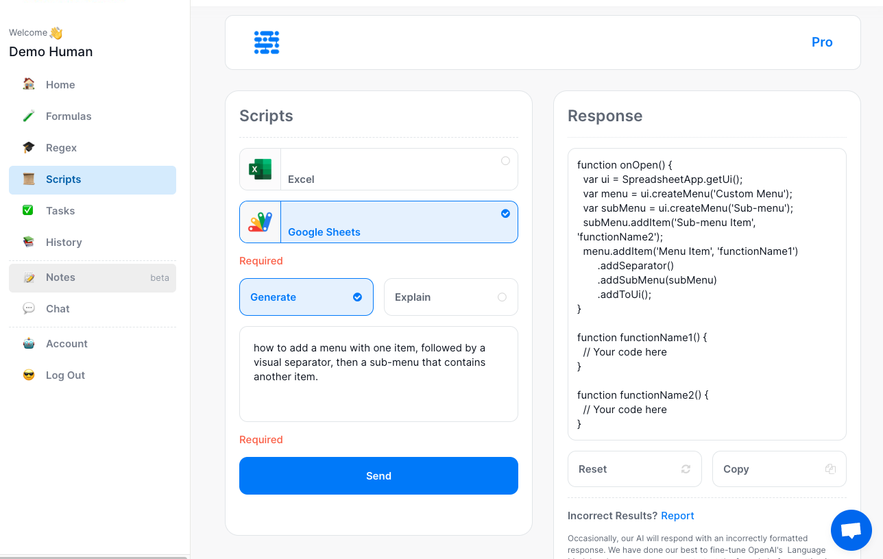
Never Stumble with an Excel Formula Again
f AI to turbocharge your Spreadsheet mastery. Say goodbye to the days of grappling with complex formulas, VBA code, and scripts. We’re here to make your work smarter, not harder....
Lucasgift is a new platform for personalized unique gift items and provides only carefully crafted gifts
onalized gift e-commerce platform! With 7 years of experience under our belts, we're confident that our fully developed website, user-friendly mobile apps, and engaging Forums page will delight thousands of customers today. Our small but mighty team of 7+2 (including talented remote workers) is dedicated to crafting one-of-a-kind gifts with care and attention to detail. We can't wait to spread joy and happiness to all our customers!...
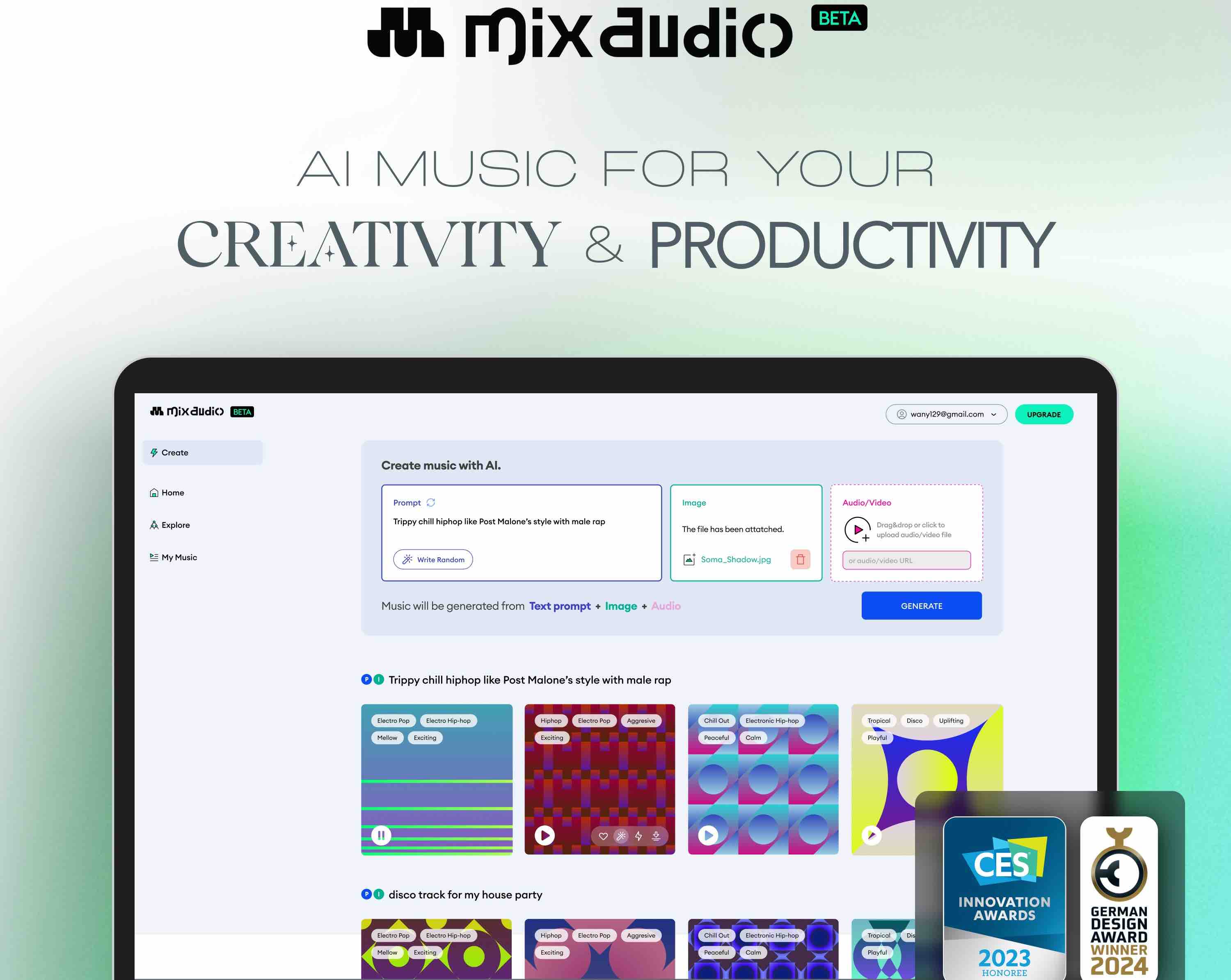
Compose, Everythink! Multi-modal AI Background music generator
': The future of music creation is here! Neutune introduces 'Mix.audio,' a state-of-the-art multi-modal AI music generator, offering a unique blend of creativity and technology. This innovative platform allows content creators to generate distinct, copyright-free background music effortlessly. Just input text, images, or audio, and in mere 3 seconds, witness AI transform these elements into a personalized music track. Enhance your creative process with the freedom to customize every detail, from track length to instrument selection, ensuring each piece perfectly aligns with your vision. Ideal for YouTubers, podcasters, and digital artists, 'Mix.audio' simplifies music creation while delivering professional-grade quality. Currently in its beta phase, 'Mix.audio' is free, inviting creators to explore and shape the future of AI-driven music production. Founded by Jongpil Lee, a leader in AI music technology, Neutune is dedicated to pushing the boundaries of music creation. Experience the revolution in sound with 'Mix.audio' – where innovation meets artistry....
Summarize Anything, Forget Nothing
ciently summarize and save online content such as articles, YouTube videos, podcasts, and more into your personal knowledge base. This tool not only categorizes your summaries but also links them with relevant content you've previously saved, revealing connections and bringing up relevant past content just when you need it....
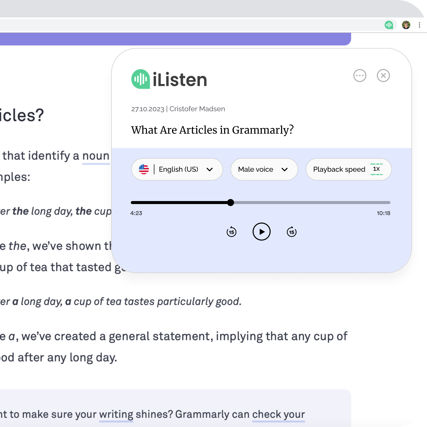
iListen is an AI-powered app that provides written or audio summaries of any article or webpage.
ates information overload, offering summaries in a very easy, digestible manner. You can either read the summaries or listen to the podcast version of them, so you can learn at your convenience. It is an easy way to intake a lot of knowledge while on the commute, doing the gardening or browsing the web. Key features include: - Fully customisable: All summaries can be customised to a summary type and voice that suits your preferences. - Podcast library: All written and audio summaries are stored in your personalised podcast library, so you access these wherever you go. - Browser Extension: Our Chrome extension let you summarize any webpage into a podcast in a few clicks and directly from your browser....
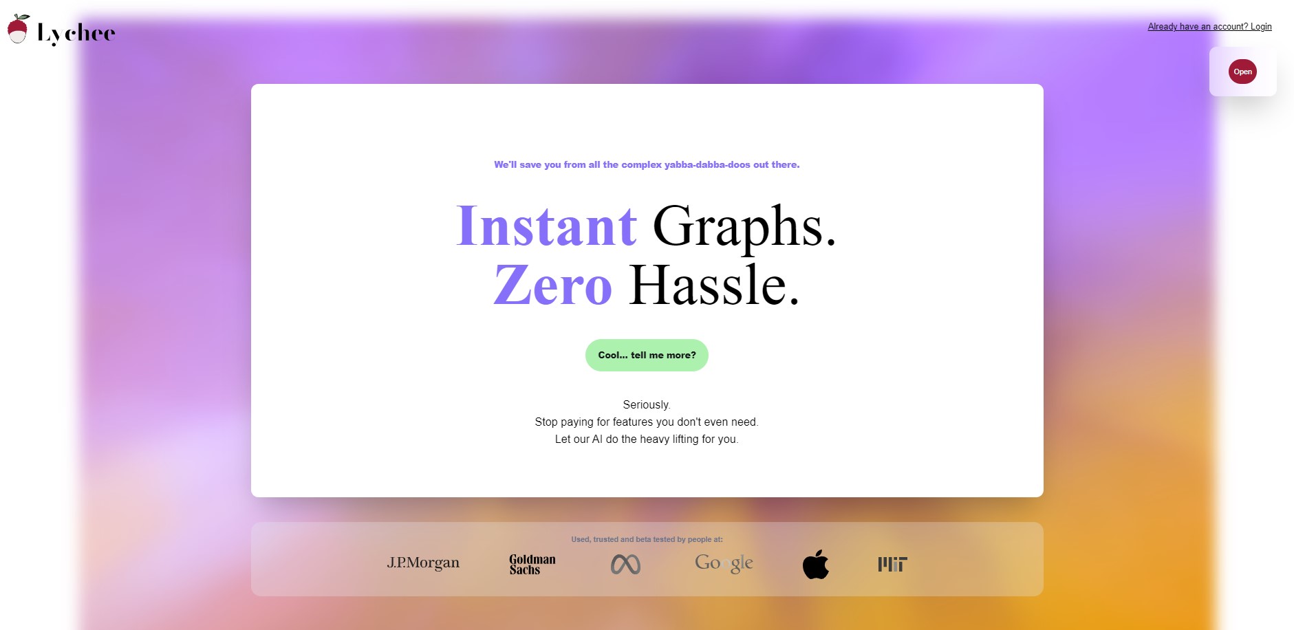
AI-Powered Data Visualization in 0.32 seconds.
Lychee, where AI meets simplicity. Tired of all these complex tools in the market when you’re just looking to turn your spreadsheets into graphs? We got you. No complex BS features you have to pay for, no coding skills, no high-tech language. Just your spreadsheets turning to graphs before you open your eyes. I’m an entrepreneur who focuses on solving the simple problems that others provide too much fluff solutions for. And that’s how I came up with Lychee. Lychee was born from a simple realization. The world of data visualization needed a breath of fresh air. As someone who navigated and used other tools, I understand the frustrations and inefficiencies that often ask for a solution. I built Lychee as a response to the clutter, the unnecessary complications. Think of it for a second. Why should you pay a lot of your hard-earned money for features that you don’t even use? Why should you go to a platform that’s reserved for the people who know about coding? Why should you look for an AI instant graph generator that doesn’t even do the job? Here at Lychee, we fuse the power of AI with the ease everyone deserves. In a world drowning in complexity, Lychee stands as a testament to the beauty of simplicity. Join us where graphs are instant and complexities are a thing of the past. Pre-order now for lifetime access before we move it to subscription pricing. That’s our gift to our legendary customers....
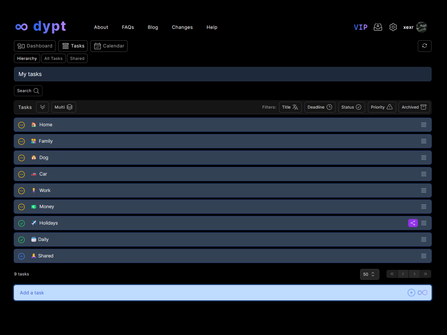
Break down tasks automatically with AI into easier-to-manage subtasks and overcome mental blocks
designed to help you take control of your life and free up more time for the things you love. It has many features, but we think you'll love these: - Organise your tasks in a hierarchy, allowing you to break down your tasks as many times as you need to get them done - Break down your tasks automatically with AI into easier-to-complete subtasks. You can even use it to generate ideas, shopping or packing lists - Add tasks from an image or photo, for example, automatically create tasks from handwritten notes or a whiteboard - Share and collaborate on tasks, publicly and privately - Set priorities, deadlines and reminders and get notifications so you never miss one - View a key summary of your tasks in the dashboard and filter your tasks to show you just the ones that matter in the moment...
Put Your Startup Here 🚀🚀🚀
Trending Startups
Codelia
Headless CMS to develop websites and e-commerce
KangaCoders
KangaCoders creates your mobile and web apps with the highest quality!
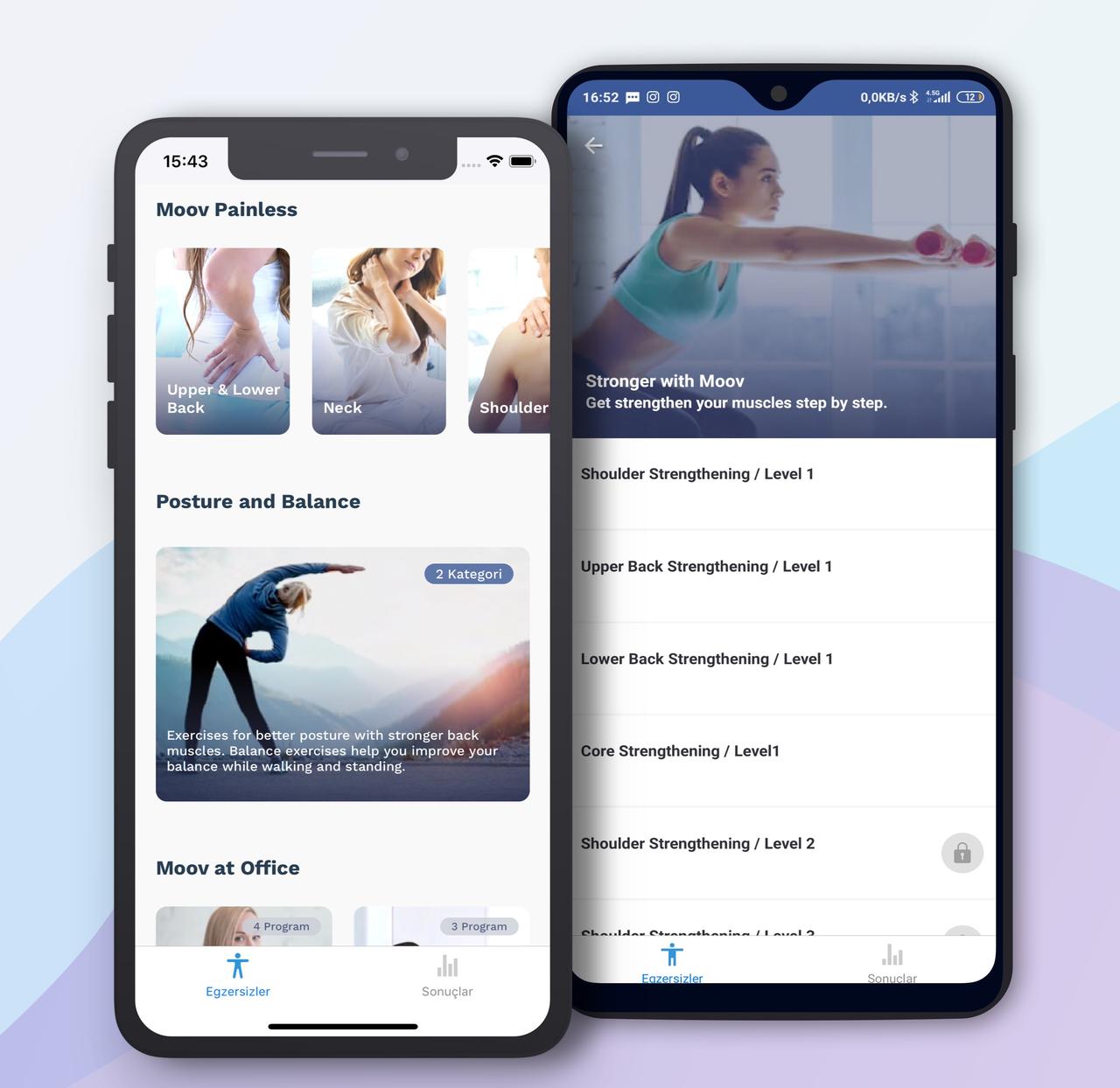
MoovBuddy
One of two people is suffering because of musculoskeletal health problems (pain, weakness, injuries, etc). MoovBuddy is a friend that offers academically proven exercises and advice for wrong daily ha
Arimugham
Arimugham is a Tech Startup that combines IT with the Media, Art & Entertainment Industry.
Good.co
Self-discovery app built for happiness in career and personal lives.
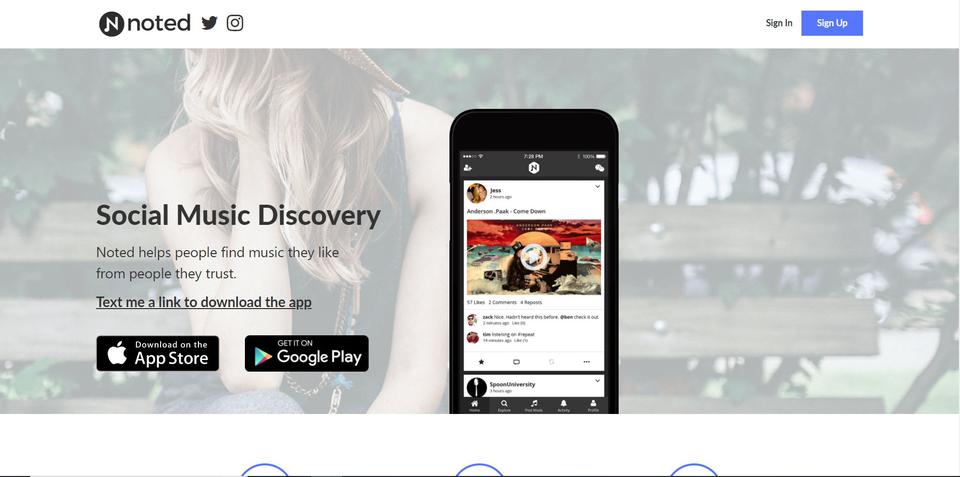
Noted
Noted is a social music discovery app that helps you find music you like from people you know.
Hiretheverified
Businesses to Freelancers - Instant Partnering!
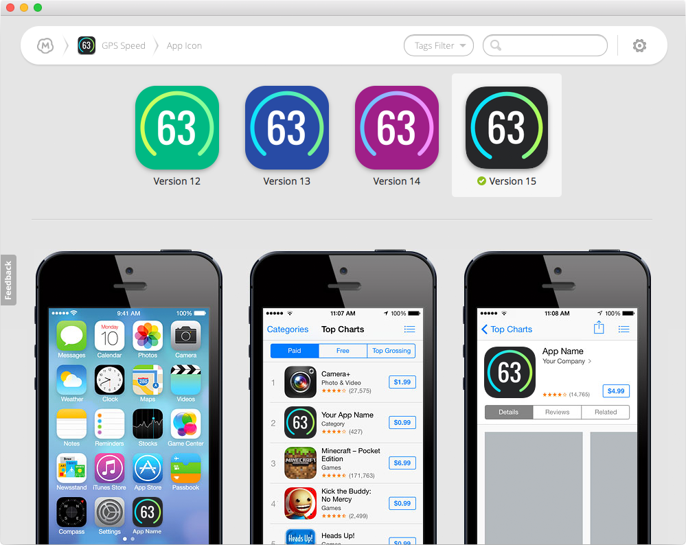
Mockup.io
The Intuitive Tool to Visualize and Collaborate on Mobile App Design with the Team and Clients
Ribose
Secure cloud collaboration for peace of mind
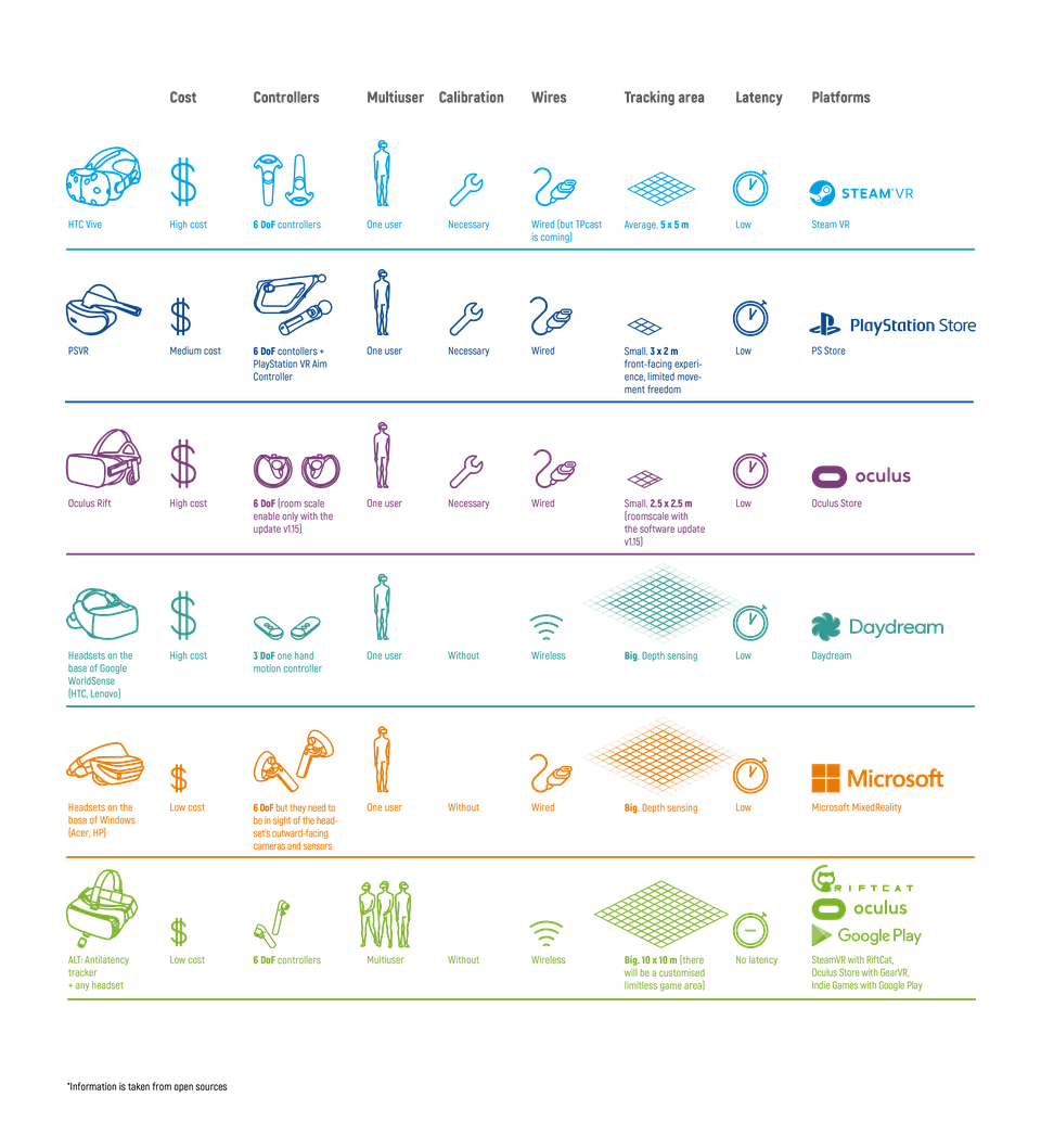
Antilatency
6 DoF positional tracking for mobile VR with position preiction


